Please Note: – This blog entry continues the thinking behind the creation of the AH Systems webinar on selecting antennas for today’s test requirements.
Supporting notes on the webinar can be found on the AH Systems website.
(Hint – click the ‘Tech Notes’ Tab and simply select the first document listed on the main page itself).
In the last entry we introduced a method that provides superior visualization of the system behavior. We continue on this theme by factoring in beamwidth loss.
Antenna Beamwidth Loss
To fully appreciate the impact of beamwidth when illuminating the test field calibration plane, we must first interpret the data on the polar chart provided as standard by all good antenna suppliers.
Make Up of the Polar Chart
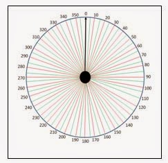
The pictures above show the two main components that make up the polar chart. The first picture shows the 360 degrees surrounding the antenna divided up into 5 degree segments. The black arrow shows the antenna boresight direction. With our higher frequency EMC antennas the maximum power density created by the antenna will always be in this direction.
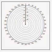
The second picture shows the concentric rings on the chart that indicate the number of dBs down from the maximum power density. The outer ring represents 0dB down (no reduction from the maximum power density), the first ring in is 3dB down (half the power), the second 6dB (quarter the power), etc.
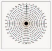
The picture above shows the complete chart with the dB rings overlaid onto the 5 degree lines.
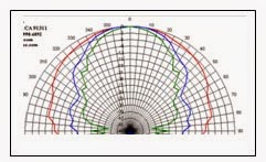
The next picture is a real polar plot provided on the AH Systems website. Note that the 0 degree marker now marks the boresight direction. The data on the chart shows the performance of the antenna at three frequencies. The red trace is the radiation pattern at 1GHz, the blue is at 9GHz, and the green is at 18GHz.
The webinar was all about better visualization of the system performance, so it explains how to mark the chart with the sector of interest, how to mark the 61000-4-3 Standard’s plus 6.0dB limit as a ‘Do Not Cross Within Sector!’ line, and finally goes on to explain how to transpose key points on the calibration plane onto the chart
Reminder: – A proviso in the webinar is that the test field is created under ideal anechoic conditions. Why? – because if we struggle to achieve a compliant field under ideal conditions, and even with the option to discount 4 of the measurement points, it will be difficult to achieve a compliant field one under practical chamber conditions, and we may need to resort to the worn out excuse called ‘room effects.’
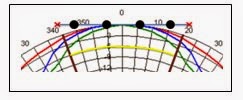
The picture above is a snapshot of the marked up chart used in the webinar.
In the snapshot the calibration points and red crosses could have easily (and more correctly) been positioned on the outer circle, but some audience members might have run away with the idea that any reflection at the plane would all be directed back through the zone of interest. This is not so, so the plane is portrayed as a straight line. As long as the calibration points are at the correct angle, and as long as the data on the chart is read from the outer circle (0dB) along this angle, the straight line portrayal of the plane is just as visually informative as one on the outer circle. Some might argue even more so.
Why call it Beamwidth LOSS?
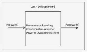
A generalized block diagram of a loss in a system is shown below
We are quick to relate this with cable loss where the system needs more power to overcome the loss. Let’s put a lossy cable in the block and assume that for an input power of 100W the output power is 80W. Then the loss in dB is 10log10 [80/100] = 1dB. We conclude we need 1dB more power from the amplifier to overcome the cable loss. No arguments here.
Likewise, due to the beamwidth phenomenon, we need more system amplifier power to create the greater power density required at the center of the calibration lane. Instead of putting the cable in the block, we can just as easily put the beamwidth effect in there. If we accept the need for more power to overcome cable loss, it is completely rational to accept the need for more power to overcome beamwidth loss.
Why Test Staff and dB Notation should be Friends
We are about to interpret the data on the snapshot chart, so this is a good point to make the case that dB notation is not out there just to annoy and confuse test staff, but rather it is there to aid computation and visualization.
We start with the ease of use and interpretation of the marked up chart. Irrespective of the actual maximum power density (could be a high value, could be a low one), the radiation pattern fall off in value is always with respect to this 0 degrees boresight maximum. In other words, the value at any angle on the chart as you move away from 0 degrees is automatically referenced / compared to this maximum in dBs.
Let us read the chart data to determine the beamwidth loss at 1GHz. We follow the red trace from the boresight in a clockwise direction until it intersects the brown line defining the periphery of the calibration plane. The intersection is around one third of the distance between the 0dB and minus 3 dB circles, making the beamwidth loss at 1GHz around 1dB. This says the calibration points on the periphery of the calibration plane will be 1dB down from an imaginary point at the dead-center of the plane. Conversely, the power density at the boresight is 1dB greater than that at the periphery, so we need more power from the system amplifier to create this extra boresight power density.
We can do the same thing with the blue trace (9GHz), and determine the beamwidth loss at 9GHz as 2dB or so. Our system design goes to 10 GHz, so we extrapolate this to 2.5dB.
Because we are using dBs we can now simply add this loss to the cable loss (also in dBs) to get the combined loss at any particular frequency of interest. And we can carry on doing this with all forms of loss to get the overall system loss. We then combine the overall system loss with the antenna dBi gain to obtain the resultant system wide gain GSYS. This in turn is then combined with the base system power to determine the amplifier power required by the system. And there ladies and gentlemen, is the beauty of dBs. There will be more on this later.
Teaser Question
Here is a teaser for the more experienced EMC Test Staff out there and for those that relish a challenge. For higher frequency EMC antennas beamwidth loss dominates antenna mismatch. For lower frequency EMC antennas VSWR loss caused by the poor antenna match dominates beamwidth loss. When expressing VSWR as a loss, I took the time to derive the equation:
Where LVSWR is the VSWR loss and ρ is the reflection coefficient presented by the antenna.
How did I derive the first equation, and more importantly, why I did I take the time to do it? It is all there in either the webinar, the supporting notes or these ‘thinking behind’ blog entries. Or maybe it takes all three.
To be continued…
-Tom Mullineaux
Lionheart Southwest
